
Again, I don’t think “This has to be bad enough that guests cancel trips!” is the threshold at which we are allowed to say something isn’t very good.
Never said that or implied that.
 Remember, I’ve shared my distaste, too.
Again, I don’t think “This has to be bad enough that guests cancel trips!” is the threshold at which we are allowed to say something isn’t very good.
Remember, I’ve shared my distaste, too.
flat logos were updated too. They look really great.
Oh, and here is the CityWalk one... it was really low res
View attachment 18493
flat logos were updated too. They look really great.
Oh, and here is the CityWalk one... it was really low res
View attachment 18493

flat logos were updated too. They look really great.
Oh, and here is the CityWalk one... it was really low res
View attachment 18493
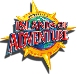
They aren't gonna swap out the lighthouse sign at IOA any time soon, ya know?
For a minute I almost believed that existed anymore :'(Sad part is, that IOA logo is going to be on all the IOA exclusive merch....oh wait
I still don't care for that IOA font in comparison to the old/existing version, but yes, the black-and-white, simplified version looks better.
I'm going to hold you to this!
They're going to put the new logo on a ton of merch and I'm going to buy it like a little shillFor a minute I almost believed that existed anymore :'(
VIDEO ESSAY OR I'M BLOCKING YOUSo this is the point where I say i have a minor in industrial engineering with a focus on human factors. Human factors is the study of how people interact with the world, more specifically with designed interfaces. These logos fail in three ways:
Universal made poor choices that will impact everyone. I could likely write a senior thesis on why these logos suck but I’ll end it at that.
- Color choices - color choices do not stand out enough. issues for those with bad eyesight or colorblind.
- Fond design - skinny typefaces are harder to read, combine that with deep shadows or 3D effects and it makes it hard to read.
- Complex Images - gradients, accents, visual flourishes, etc make word detection hard.
Funnily enough, it’s the same font - just tweaked for a different presentation.
I can buy that, but that only shows what a difference positioning, shaping, thickness, shading, and color make!
Are you familiar with the 7 stages of grief?Remember a few years ago when they announced that they were going to start charging for large lockers at the attractions, and that the regular lockers would be smaller?
Everyone LOST THEIR MINDS. Now it's 2023.. and no one cares anymore.
Just wanted to make sure you guys remembered.
I think everyone on this site jumped straight to Anger for the logos.Are you familiar with the 7 stages of grief?
Which do you think we are in right now concerning lockers (which was still a silly thing to do)?