- Jun 5, 2023
- 135
- 951
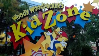
This is the actual marquee,I'm guessing it's just a temporary construction time sign. Kind of like the stuff they had out for the Minions renovation. It's nowhere close to an opening date, so there's really no need for permanent stuff at this point in time.